Since I posted the huge collection of Large Background Websites, I received several email requests on how to make a large background site with CSS. So, I thought it would be a good idea to share my techniques on designing large background websites. In this tutorial, I will provide various CSS examples on how you can create a large background site using either a single or double images.
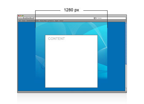
Common Mistake: Background Gets Cropped (see demo)
Take a look at the demo file, it looks fine under 1280px. But if you have a high resolution display, you will see the background gets cut off on the sides.
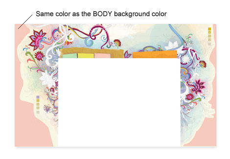
A quick solution to fix the problem mentioned earlier: make the edge of the image the same color as the BODY background color. Here, I’m going to use Web Designer Wall as an example. Take a look at the image below and notice the edge is a solid color?
CSS Part
The CSS part is very simple. Specify the background image (position it center, top) for the BODY element.
Notice there are two extra lines in the BODY selector. That is to prevent the background image from shifting when you resize the browser smaller than the content width (it happens in Firefox).
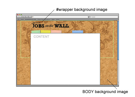
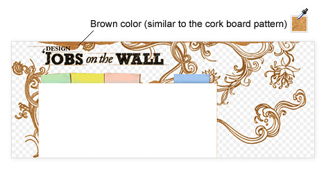
For this example, I’m going to use the job board design, Design Jobs on the Wall. I have a cork board pattern repeating in the BODY tag and a wrapper background in the center.
The trick here is to export the GIF matte with a brown color that is similar to the cork board pattern.
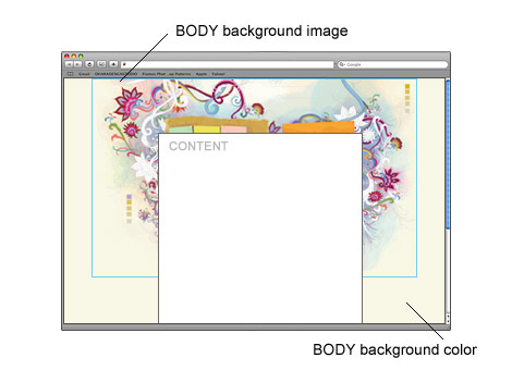
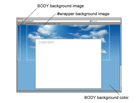
In this example, I have a 1px gradient that is repeated horizontally for the BODY tag. Then I attached a cloud background in the center of the #wrapper tag.
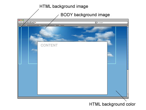
Update: Sky Background Using HTML Selector (see demo)
Thanks to the comments from the readers. Below is an example of the sky background using HTML selector to display the gradient background, so the #wrapper DIV tag is not required. It is a much more cleaner approach.
This is the Chapter II of the Complete WordPress Theme Guide series. This chapter will show you how to build a custom WordPress theme. Although the Codex site provides very good documentations on how to create a theme, but I find it too complicated for a beginner. In this tutorial, I will explain the basics of how WordPress theme works and show you how to convert a static HTML template into a theme. No PHP skill is required, but you need Photoshop and CSS skills to create your own design.
1. The Blog Frontend
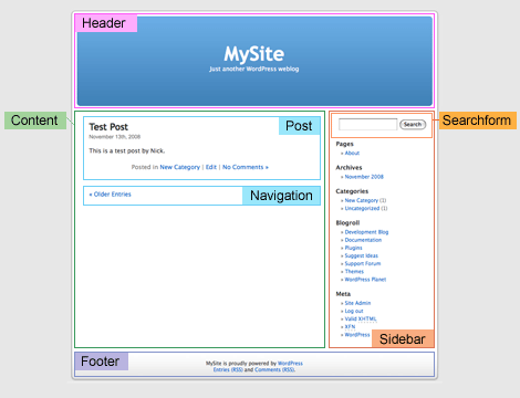
Before you start, let’s take a look at the WordPress default theme and see how it is structured. Take note of the elements (header, post title, search form, navigation, footer, etc.).
Default Frontpage (index.php)
Default Single (single.php)
2. Photoshop Mockups
Based on the information gathered from the default theme, design a Photoshop mockup of your blog. Here I’m using GlossyBlue, one of my free WordPress themes, as an example. Download the demo.zip to see the Photoshop file.
3. HTML + CSS
After the PSD design is done, create a static HTML+CSS template of each page. You can use my GlossyBlue HTML files in the demo.zip to follow this tutorial. Extract the zip and take a look at the index.html, single.html, and page.html. Later in the tutorial, I will use these HTML files and convert them into a theme.
Why Create a Static HTML File First?
Mainly because it will make the development process a lot easier. I usually create a HTML file for every template that I need, test it across all browsers, validate both HTML and CSS markups, then all I have to do is cut & paste the WordPress code. By doing so, I don’t have to worry about HTML or CSS bugs during my theme making process.
4. How WordPress Theme Works
If you go the default theme folder (wp-content/themes/default), you should see many PHP files (called template file) and one style.css file. When you are viewing the front page, WordPress actually uses several template files to generate the page (index.php << header.php, sidebar.php, and footer.php).
Copy the GlossyBlue HTML folder into the wp-content/themes folder. Then, go to the default theme folder, copy the comments.php and searchform.php file to the glossyblue folder.
6. Style.css
Go to the WordPress default theme folder, open the style.css file. Copy the commented code at the top and paste it to the GlossyBlue style.css file. Change the theme name and the author information as you desire.
7. Splitting The Files
Now you need to understand where to split the file into several files: header.php, sidebar.php, and footer.php. The image below shows a simplified version of my index file and how the markups should split.
8. Header.php
Open the index.html file. Cut from the top to where the <!--/header --> ends, paste it in a new PHP file, and save the file as header.php.
Go to the default theme folder, open the header.php. Copy and replace the tags where it requires PHP code (Template Tag): <title>, <link> stylesheet, <h1>, and <div class=description>.
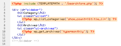
Navigation Menu (wp_list_pages)
Replace the <li> tags in the <ul id=nav> with <?php wp_list_pages('sort_column=menu_order&depth=1&title_li=');?>
Back to the index.html file, cut from where the <form id=searchform> start to the closing tag of <div id=sidebar> and paste it in a new PHP file, save it as sidebar.php.
Replace the <form id=searchform> wrap with <?php include (TEMPLATEPATH . '/searchform.php'); ?>.
Replace the category <li> tags with <?php wp_list_categories('show_count=1&title_li='); ?>
Replace the archive <li> tags with <?php wp_get_archives('type=monthly'); ?>
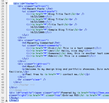
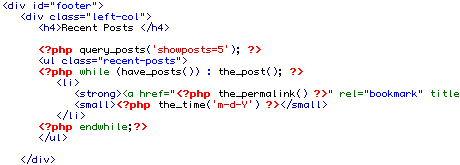
Back to the index.html file, cut from the <div id=footer> tag to the end of </html> and paste it in a new PHP file, save it as footer.php.
Recent Posts
Here I used the query_post to display the 5 latest posts.
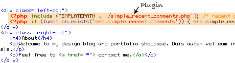
Recent Comments
Recent comments are generated by a plugin (included in the theme folder).
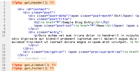
11. Index.php
Now in your index.html file, you should only have the <div id=content> wrap. Save the file as index.php. Insert the line:get_header, get_sidebar, and get_footer in the same order as your layout structure.
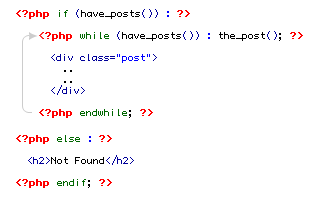
12. Understanding The Loop
The image below illustrates how The Loop works. The Loop is used to display blog posts and it also lets you control what to display. Basically, The Loop checks if there are posts in your blog, while there are posts, display it, if no post found, say "Not Found".
13. Copy The Loop
Go to the default theme folder, open the index.php file. Copy The Loop from the default index.php and paste it in between the <div id=content>..</div>. Then, replace the static text with the WordPress Template Tags: post date, title, category, comments, next and previous link.
14. Preview The Theme
Congrats! You’ve done the front page (the main part of the theme). Now, login to your admin panel, go to the Design tab, you should see the GlossyBlue theme, activate it and go to the front page to preview the theme.
15. Single.php
Now, it is time to do the single.php template. If you want, you can go through the same process — cut & paste from the default theme. But, I find it easier to use the index.php that you just created and save it as single.php. Open the default theme single.php file and copy the Template Tags over. Then include the comments_template. The image below highlights what I’ve changed:
16. Page.php
With the single.php template you just created, save it as page.php. Remove the post date, comment form, next/previous link… and that’s it.. there goes your page.php template.
17. Delete The HTML Files
Delete all the HTML files in the glossyblue folder (we don’t need them anymore). Technically, that is enough for a basic WordPress theme. You may notice there are more PHP files in the default theme. Well, you don’t really need those files if you just want a basic theme. For example, if the search.php or 404.php is not present in the theme folder, WordPress will automatically use the index.php to render the page. Read the Template Hierarchy for more details.
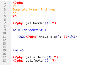
18. WordPress Page Template
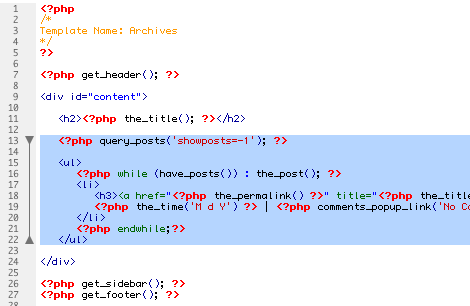
Ok, final example. I will show you how to use Page Template to create an archive page that will list all posts on your blog (good for sitemap). Copy the archives.php file from the default theme folder. Delete the unwanted code and you should have something like this:
Here I’m using the query_post (showposts=-1 means display all posts) to display a list of all posts.
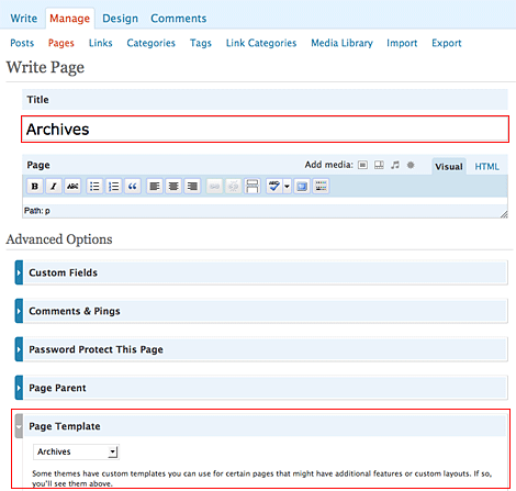
Now, login to your admin panel, write a new page, title it Archives. On the Page Template dropdown, select Archives.
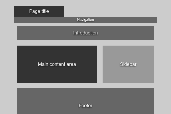
This is what our page is going to look like when finished:
Pretty much your every day blog design. Header with title, horizontal navigation, content area with comments and form, sidebar and a footer. Nothing too special. Let's get building.
HTML 5
HTML 5 is the next major version of HTML. It introduces a bunch of new elements that will make our pages more semantic. This will make it a lot easier for search engines and screenreaders to navigate our pages, and improve the web experience for everyone. In addition, HTML 5 will also include fancy APIs for drawing graphics on screen, storing data offline, dragging and dropping, and a lot more. Let's get started marking up the blog page.
Basic Structure
Before we begin marking up the page we should get the overall structure straight:
In HTML 5 there are specific tags meant for marking up the header, navigation, sidebar and footer. First, take a look at the markup and I'll explain afterwards:
It still looks like HTML markup, but there are a few things to note:
In HTML 5, there is only one doctype. It is declared in the beginning of the page by <!doctype html>. It simply tells the browser that it's dealing with an HTML-document.
The new tag header is wrapped around introductory elements, such as the page title or a logo. It could also contain a table of contents or a search form. Every header typically contains a heading tag from <h1> to <h6>. In this case the header is used to introduce the whole page, but we'll use it to introduce a section of the page a little later.
The nav-tag is used to contain navigational elements, such as the main navigation on a site or more specialized navigation like next/previous-links.
The section-tag is used to denote a section in the document. It can contain all kinds of markup and multiple sections can be nested inside each other.
aside is used to wrap around content related to the main content of the page that could still stand on it's own and make sense. In this case we're using it for the sidebar.
The footer-tag should contain additional information about the main content, such as info about who wrote it, copyright information, links to related documents and so on.
Instead of using divs to contain different sections of the page we are now using appropriate, semantic tags. They will make it a lot easier for search engines and screen readers to figure out what's what in a page.
Marking Up the Navigation
The navigation is marked up exactly like we would do it in HTML 4 or XHTML, using an unordered list. The key is that this list is placed inside the nav-tags.
<p>Lorem ipsum dolor sit amet, consectetur adipisicing elit, sed do eiusmod tempor incididunt ut labore et dolore magna aliqua. Ut enim ad minim veniam, quis nostrud exercitation ullamco laboris nisi ut.</p>
</section>
<section id="intro">
 <header>
  <h2>Do you love flowers as much as we do?</h2>
 </header>
 <p>Lorem ipsum dolor sit amet, consectetur adipisicing elit, sed do eiusmod tempor incididunt ut labore et dolore magna aliqua. Ut enim ad minim veniam, quis nostrud exercitation ullamco laboris nisi ut.</p>
</section>
We add an id to the section tag so we can identify it later when styling. We use the header tag to wrap around the introductory h2 element. In addition to describing a whole document, the header-tag should also be used to describe individual sections.
Marking Up the Main Content Area
Our main content area consists of three sections: the blog post, the comments and the comment form. Using our knowledge about the new structural tags in HTML 5, it should be easy to mark it up.
Marking up the Blog Post
Go through the markup and I'll explain the new elements afterwards.
<p>Posted on <timedatetime="2009-06-29T23:31:45+01:00">June 29th 2009</time> by <ahref="#">Mads Kjaer</a> - <ahref="#comments">3 comments</a></p>
</header>
<p>Lorem ipsum dolor sit amet, consectetur adipiscing elit. Proin euismod tellus eu orci imperdiet nec rutrum lacus blandit. Cras enim nibh, sodales ultricies elementum vel, fermentum id tellus. Proin metus odio, ultricies eu pharetra dictum, laoreet id odio...</p>
</article>
</section>
<section>
 <article class="blogPost">
  <header>
   <h2>This is the title of a blog post</h2>
   <p>Posted on <time datetime="2009-06-29T23:31:45+01:00">June 29th 2009</time> by <a href="#">Mads Kjaer</a> - <a href="#comments">3 comments</a></p>
  </header>
  <p>Lorem ipsum dolor sit amet, consectetur adipiscing elit. Proin euismod tellus eu orci imperdiet nec rutrum lacus blandit. Cras enim nibh, sodales ultricies elementum vel, fermentum id tellus. Proin metus odio, ultricies eu pharetra dictum, laoreet id odio...</p>
 </article>
</section>
We start a new section and wrap the whole blog post in an article-tag. The article tag is used to denote an independent entry in a blog, discussion, encyclopedia, etc. and is ideal to use here. Since we are viewing the details of a single post we only have one article, but on the front page of the blog we would wrap each post in an article-tag.
The header element is used to present the header and metadata about the blog post. We tell the user when the post was written, who wrote it and how many comments it has. Note that the timestamp is wrapped in a
The year followed by a figure dash (a minus sign to you non-typography nerds)
The month followed by a figure dash
The date
A capital T to denote that we are going to specify the local time
The local time in the format hh:mm:ss
The time zone relative to GMT. I'm in Denmark which is 1 hour after GMT, so I write +01. If you were in Colorado you would be 7 hours behind GMT, and you would write -07.
Marking up the Comments
Marking up the comments is pretty straight-forward. No new tags or attributes are used.
<ahref="#">George Washington</a> on <timedatetime="2009-06-29T23:35:20+01:00">June 29th 2009 at 23:35</time>
</header>
<p>Lorem ipsum dolor sit amet, consectetur adipisicing elit, sed do eiusmod tempor incididunt ut labore et dolore magna aliqua. Ut enim ad minim veniam, quis nostrud exercitation ullamco laboris nisi ut.</p>
</article>
<article>
<header>
<ahref="#">Benjamin Franklin</a> on <timedatetime="2009-06-29T23:40:09+01:00">June 29th 2009 at 23:40</time>
</header>
<p>Lorem ipsum dolor sit amet, consectetur adipisicing elit, sed do eiusmod tempor incididunt ut labore et dolore magna aliqua. Ut enim ad minim veniam, quis nostrud exercitation ullamco laboris nisi ut.</p>
</article>
</section>
<section id="comments">
 <header>
  <h3>Comments</h3>
 </header>
 <article>
  <header>
   <a href="#">George Washington</a> on <time datetime="2009-06-29T23:35:20+01:00">June 29th 2009 at 23:35</time>
  </header>
  <p>Lorem ipsum dolor sit amet, consectetur adipisicing elit, sed do eiusmod tempor incididunt ut labore et dolore magna aliqua. Ut enim ad minim veniam, quis nostrud exercitation ullamco laboris nisi ut.</p>
 </article>
 <article>
  <header>
   <a href="#">Benjamin Franklin</a> on <time datetime="2009-06-29T23:40:09+01:00">June 29th 2009 at 23:40</time>
  </header>
  <p>Lorem ipsum dolor sit amet, consectetur adipisicing elit, sed do eiusmod tempor incididunt ut labore et dolore magna aliqua. Ut enim ad minim veniam, quis nostrud exercitation ullamco laboris nisi ut.</p>
 </article>
</section>
Marking up the Comment Form
Several enhancements to forms have been introduced in HTML 5. You longer have to do client-side validation of required fields, emails, etc. The browser takes care of this for you.
There are new two new types of inputs, email and url. Email specifies that the user should enter a valid E-mail, and url that the user should enter a valid website address. If you write required as an attribute, the user cannot submit an empty field. "Required" is a boolean attribute, new to HTML 5. It just means that the attribute is to be declared without a value.
Marking up the Sidebar and Footer
The markup of the sidebar and footer is extremely simple. A few sections with some content inside the appropriate aside- and footer-tags.
You can view the final, unstyled markup here. Now for the styling.
Styling with CSS 3
CSS 3 builds upon the principles about styles, selectors and the cascade that we know so well from earlier versions of CSS. It adds loads of new features, including new selectors, pseudo-classes and properties. Using these new features it becomes a lot easier to set up your layout. Let's dive in.
Basic Setup
To start off with we are going to define some basic rules concerning typography, background color of the page, etc. You'll recognize all of this from CSS 2.1
First we reset margin- and padding-styles with a simple rule. In a production environment I would use a more complete CSS Reset such as Eric Meyer's (for CSS 2.1) but for the scope of the tutorial this will do.
We then tell the browser to render all the new HTML 5 elements as block. The browsers are fine with elements they don't recognize (this is why HTML 5 is somewhat backwards compatible), but they don't know how those elements should be rendered by default. We have to tell them this until the standard is implemented across the board.
Also note how I've chosen to size the fonts in pixels instead of ems or %. This is to maintain the progressive nature of the tutorial. When the major browsers one day are completely finished implementing HTML 5 and CSS 3 we will all have access to page zooming instead of just text resizing. This eliminates the need to define sizes in relative units, as the browser will scale the page anyway.
See what the page looks like with the basic styling applied. Now we can move on to styling the rest of the page. No additional styles are required for the header, so we'll go straight to the navigation.
Styling the Navigation
It is important to note that the width of the body has been defined as 940px and that it has been centered. Our navigation bar needs to span the whole width of the window, so we'll have to apply some additional styles:
We position the nav-element absolutely, align it to the left of the window and make it span the whole width. We'll center the nested list to display it within the boundaries of the layout:
nav ul {
 margin: 0 auto;
 width: 940px;
 list-style: none;
}
Now we'll define some additional styles to make the navigation items look prettier and align them to the grid the layout is based on. I've also included a style for highlighting the page the user is on, and some custom styling for the subscription-link.
nav ul li a { display: block; margin-right: 20px; width: 140px; font-size: 14px; line-height: 44px; text-align: center; text-decoration: none; color: #777; }
nav ul li a:hover { color: #fff; }
nav ul li.selected a { color: #fff; }
nav ul li.subscribe a { margin-left: 22px; padding-left: 33px; text-align: left; background: url("rss.png") left center no-repeat; }
Styling the Introduction
The markup for the introduction is pretty simple: A section with a heading and a paragraph of text. However, we'll use some new CSS 3 tricks to make it look more appealing.
We are using two new properties. The first one is background-size, which allows you to scale the background-image. In our case, we scale it to 100% on both axes. If the box expands as we add more content to it, the gradient background will scale as well. This is something that was not possible in CSS 2.1 without non-semantic markup and miscellaneous browser issues.
The second new property is border-radius, which applies rounded corners to the element. The radius of our rounded corners are 22px in every corner. You could specify different values for each corner or choose to only round individual corners.
Unfortunately, neither of the properties are fully implemented into the major browsers. However, we can get some support by using vendor-specific attributes. Background-size is supported by newer versions of Safari, Opera and Konqueror. Border-radius is supported by newer versions of Safari and Firefox.
Since we have a background-color defined, there will be no major problems in browsers that don't support background-size, such as Firefox. Now we just need to style the heading and the text.
#intro {
 ...
 background: #467612 url("intro_background.png") top left (287px 100%) repeat-x,
   url("intro_flower.png") top right (653px 100%) no-repeat;
 ...
}
We give the two background images explicit dimensions to ensure that they don't overlap, and we're set. Note the shorthand notation of background-size.
Unfortunately, no browser reliably supports this yet, so we'll have to do it the old-fashioned way: by including an inline image and positioning it using CSS. See the final example to see how it was done.
Styling the Content Area and Sidebar
The content area and sidebar are going to be aligned beside each other. Traditionally you would do this by using floats, but in CSS 3 we are going to use tables!
"What?! Tables?" you might ask and look confused. You probably learned years ago that using tables for web layout is a big no-no, and it still is. You should never use the table-element to mark up a layout. However, in CSS 3 we can make elements behave like tables without it ever showing in the markup! To start off with, we're going to need some divs to group the sections in a little more logical manner.
<div id="content">
 <div id="mainContent">
  <section>
   <!-- Blog post -->
  </section>
  <section id="comments">
   <!-- Comments -->
  </section>
  <form>
   <!-- Comment form -->
  </form>
 </div>
 <aside>
  <!-- Sidebar -->
 </aside>
</div>
Everything still makes sense semantically, but now we can style it. We want the #content div to behave like a table, with #mainContent and aside as table-cells. With CSS 3, this is very easy:
That's all! No more floating, faux column background images, clearing or collapsing margins. We've made the elements behave like a table, and this makes it much easier for us to do layout.
Styling the Blog Post
The styling of the post header is rather trivial so I'll skip to the fun part: the multi-column layout.
Multiple columns
Multiple columns of text was previously impossible without manually splitting the text, but with CSS 3 it's a piece of cake, although we have to add a div around the multiple paragraphs for this to work with current browsers.
.blogPost div {
 column-count: 2;
 column-gap: 22px;
}
We want 2 columns and a gap of 22px between the columns. The additional div is needed because there is currently no supported way of making an element span more than one column. In the future, however, you'll be able to specify the column-span property, and we could just write:
Of course the column-count and column-gap properties are only supported by some browsers, Safari and Firefox. We have to use the vendor-specific properties for now.
The first "3px" tells the browser where we want the shadow to stop horizontally. The second "3px" tells it where we want the shadow to stop vertically. The last "7px" is how blurred the border should be. If you set it to 0 it will be completely solid. Last but not least we define the base color of the shadow. This color is of course faded, depending on how much you blur the shadow.
It probably comes as no surprise that this property is not implemented in all browsers yet. In fact, it only works in Safari, and you have to use the vendor-specific property.
Zebra-striping, or highlighting every second element in a series, has traditionally involved selecting all the elements via javascript, then looping through them and highlighting all the odd elements. CSS 3 introduces the pseudo-class "nth-child", which makes it ridiculously simple to do this without javascript. We'll use it to zebra-stripe the comments.
The weird value "2n+1" is actually pretty simple if you understand what it stands for:
2n selects every second item. If you wrote 3n it would select every third item, 4n every fourth item, and so on.
The +1 tells the browser to start at element 1. If you are familiar with programming you probably know that all arrays start at 0, and this is also true here. This means that element 1 is actually the second element in the series.
Since the standard includes the two most used values as shorthand, odd and even. The rest of the comment styling should be simple to understand with your new knowledge.
Styling the Comment Form, Footer and Sidebar
A couple of CSS 3 techniques are reused in the styling of the comment form, footer and sidebar. In the comment form and the footer I've used the same type of table layout technique used in the main layout. In the sidebar border-radius is used to add rounded corners to the different sections.
The page renders correctly in Safari 4 and newer webkit-based browsers, as it is the only rendering engine that supports all of the CSS 3 techniques we have used. Firefox 3 has some problems applying rounded corners to our flower image and it doesn't support background-size, but besides that the layout works. I've chosen to ignore Internet Explorer as it requires a bit of hacking to get HTML 5 to work. You could also define some more rules and get everything working across major browsers, but all of this is outside the scope of the tutorial.
Conclusion
When HTML 5 and CSS 3 are one day implemented in all browsers it will be a lot easier to build websites. We'll finally be able to stop using floats for layout (which they were never meant to be used for), and we will spend considerably less time writing javascript to scale our background images or zebra-stripe our tables. Hopefully we will use all this extra time to study some long-neglected areas of web design, like front end optimization and proper information architecture.

 Default Frontpage (index.php)
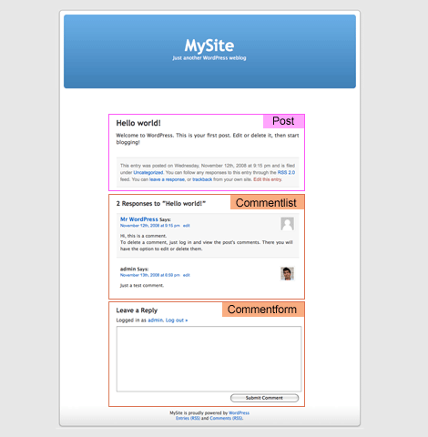 Default Single (single.php)


